There are numerous programming languages used in the information technology sector. Even though most programming languages share a common syntax, each has unique features.
Naturally, some programming languages are better suited for creating front-end applications than back-end ones.
One of the few languages, JavaScript, is used for both, making it a popular option for creating visualizations, especially a JavaScript Gantt chart.
It is also conceivably the most flexible programming language and is frequently used for creating a simple JavaScript Gantt chart.
You can modify your chart however you want with FusionCharts, whether functional or purely aesthetic.
Additionally, you can add layers to the charts using annotations, modify the charts using properties, or build complex visualizations using events and their API. So this article will focus on the JavaScript Gantt chart and how to add one to your web application.
What Is A Gantt Chart?
There are many different types of charts available in FusionCharts, each with its own advantages. Some strong charts for data visualization include flow charts, pie charts, and Gantt charts.
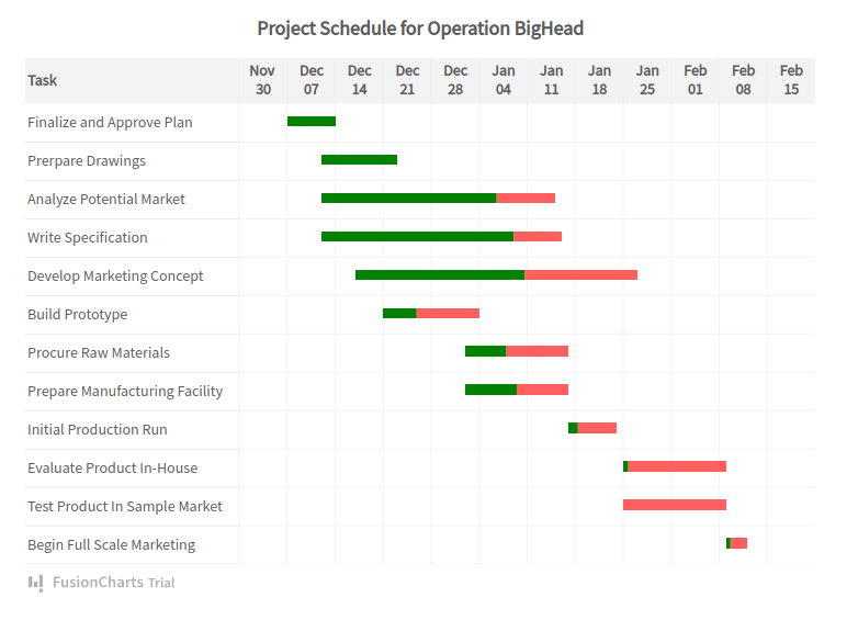
What makes JavaScript Gantt charts unique is that they show tasks on the y-axis and time scales on the x-axis and provide strong project management and planning. The taskbar lengths determine the new task duration between the start and end dates.
Tooltips support HTML and CSS formatting and show the precise amount of time that has passed in a Gantt chart. Data for Gantt charts can easily be loaded from your database or JSON, and many high-performance open-source examples are available.
Advantages of Gantt Charts
JavaScript Gantt charts have several advantages. Gantt charts also allow you to display the time and date, making them useful for time-series data.
Additionally, you can alter the labels using data that has multiple and erroneous divisions of dates on a timeline. Furthermore, you can alter the aesthetic features of each category.
Gantt charts also let you change the input and output data formats. This enables you to input dates in a JSON file in a particular format and alters the output format differently. Additionally, you can use the slackFillColor attribute to display each task’s completion rate as a percentage.
Furthermore, Gantt charts also allow you to include a highly customizable data table on the chart’s side. You can also limit the Gantt view pane area only to display certain data or spans of time. A task can be connected to a process by providing an ID.
Consequently, you can define multiple tasks for each process in this manner. This is useful when you indicate allotted work for all team members in a Gantt chart. So, it becomes easy and useful to visualize multiple jobs that could be allocated to each member of a team.
Features
With Gantt charts, you can choose to hide or show task labels, individual taskbar dates, and even the ability to group individual taskbars together.
Moreover, you can also opt to create custom connectors and connect any two tasks. The connectors can be connected to either the start, end, or both tasks in one of four different ways.

Additionally, you can show milestones as polygons or stars at specific dates with highly customizable properties. For milestones, you can also show additional tool text.
Gantt charts can also be enhanced with trend lines or zones to draw attention to a specific date or range of dates. You could, for instance, add a trend line to symbolize “Today,” “Holiday,” and so on.
Furthermore, you can alter tooltip properties to display task dates or as a tooltip component. Even more, macros can be added to make dynamic tooltips. With Gantt charts, you can add additional macros and create dynamic tooltips.
Finally, Gantt charts let you include a legend to show color codes and fully customize the legend’s appearance. The chart’s colors can be changed using pre-defined palettes and selectors for single-color themes.
Furthermore, the width ratio for distributing the data table and Gantt area can be specified. Additionally, you can display task bars with rounded edges and alter the gradient mix and shadow effect for taskbars.
Moreover, you can annotate the Gantt chart to display additional information. Additionally, you can turn on hovering and customize its characteristics for taskbars, connectors, processes, and categories.
How To Add A Simple JavaScript Gantt Chart To A Website In FusionCharts?
Now that you know what makes Gantt charts so special, here is what you will need to create a JavaScript Gantt chart:
-
- Data you want to use
- A specified visual timeline
- Defined processes
- Defined tasks
FusionCharts Suite XT is perhaps the most complete JavaScript charting solution. It has many features that make it a great visualization tool. Its primary focus is to simplify the process of data visualization. Components for FusionCharts can be set up using CDN, local files, or NPM.
Before installing the FusionCharts package with npm, make sure that Node.js is already installed on your system. Additionally, make sure you have a bundler installed, like webpack or parcel.
Note: It’s important to remember that FusionCharts will accept data in JSON format.
Now let us look at how we can use JavaScript and FusionCharts to create a simple Gantt chart that you can add to your application:
var app = angular.module("myApp", ["ng-fusioncharts"]);
app.controller("MyController", function($scope) {
$scope.myDataSource = {
chart: {
dateformat: "mm/dd/yyyy",
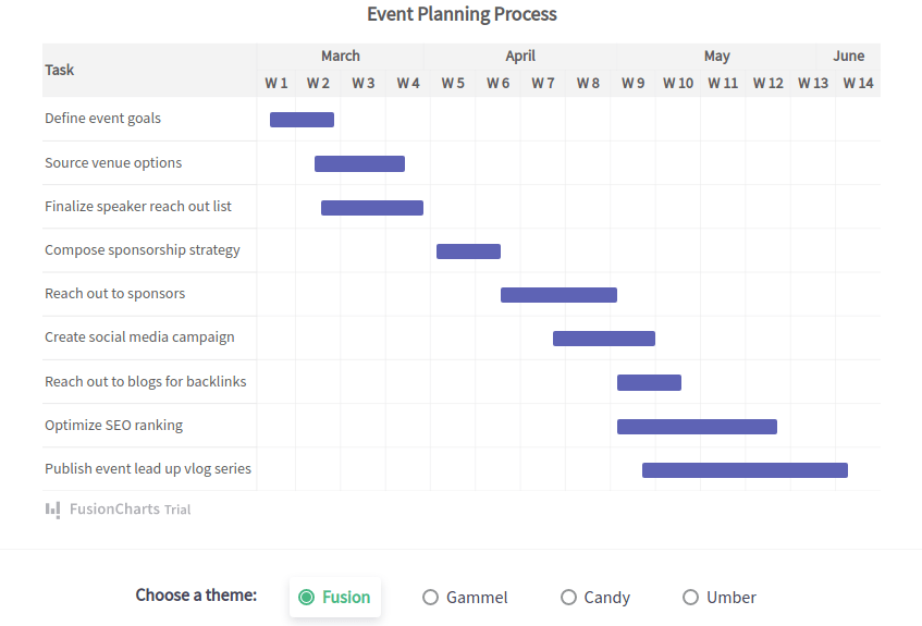
caption: "Event Planning Schedule",
theme: "fusion",
canvasborderalpha: "40",
ganttlinealpha: "50"
},
tasks: {
color: "#5D62B5",
task: [
{
start: "03/07/2018",
end: "03/17/2018"
},
{
start: "03/14/2018",
end: "03/28/2018"
},
{
start: "03/15/2018",
end: "03/31/2018"
},
{
start: "04/02/2018",
end: "04/12/2018"
},
{
start: "04/12/2018",
end: "04/30/2018"
},
{
start: "04/20/2018",
end: "05/06/2018"
},
{
start: "04/30/2018",
end: "05/10/2018"
},
{
start: "04/30/2018",
end: "05/25/2018"
},
{
start: "05/04/2018",
end: "06/05/2018"
}
]
},
processes: {
headertext: "Task",
headeralign: "left",
fontsize: "14",
isbold: "0",
align: "left",
process: [
{
label: "Define event goals"
},
{
label: "Source venue options"
},
{
label: "Finalize speaker reach out list"
},
{
label: "Compose sponsorship strategy"
},
{
label: "Reach out to sponsors"
},
{
label: "Create social media campaign"
}
]
},
categories: [
{
category: [
{
start: "03/05/2018",
end: "03/31/2018",
label: "March"
},
{
start: "04/01/2018",
end: "04/30/2018",
label: "April"
}
]
},
{
category: [
{
start: "03/05/2018",
end: "03/11/2018",
label: "W 1"
},
{
start: "03/12/2018",
end: "03/18/2018",
label: "W 2"
},
{
start: "03/19/2018",
end: "03/25/2018",
label: "W 3"
},
{
start: "03/26/2018",
end: "04/01/2018",
label: "W 4"
},
{
start: "04/02/2018",
end: "04/08/2018",
label: "W 5"
},
{
start: "04/09/2018",
end: "04/15/2018",
label: "W 6"
},
{
start: "04/16/2018",
end: "04/22/2018",
label: "W 7"
},
{
start: "04/23/2018",
end: "04/29/2018",
label: "W 8"
}
]
}
]
};
});